The well
Brand guide
*Current as of Feb 2024

*Current as of Feb 2024
This brand guide exists to help us (staff, volunteers, trustees etc.) maintain a universal standard of visual identity across The Well’s communications. Refer back to this page as a reference whenever needed.
Here we will cover The Well logo, colours, fonts, imagery, language & other elements.
The original The Well logo was designed by BEN HODGES - a founding member of The Well in 2015.
This guide builds from the foundations of his design legacy.
The core feature of The Well’s logo design is the water drop. This should be present in all of The Well’s affiliated logo designs. It represents the water of life: John 4:14 “but whoever drinks of the water that I will give him shall never thirst, but the water that I will give him will become in him a well of water springing up to eternal life.”
This drop features in the core logo and sub-brands such as Deeper, Little Droplets and will be present in future church plants such as The Well at Woodseats.

the well core logo
Note: Water drop, font is GOBOLD (see font details for more)
HEX code White: #ffffff
HEX code Black: #000000
*As of Sep 21.


*Please note at The Well we want to create a branded house, not a house of brands. As such we will be reviewing the various ministries and their brands in the future.
Here are the fonts we use and how they should be used. There tends to be a primary header (H1) supporting header (H2) a tertiary version (H3) and body text (normal).
At The Well two core fonts are employed - GOBOLD and Maax.
Please note these fonts should be adhered to in ALL circumstances.
Exceptions:
Print - you can use ‘Arial regular’ as a body font in a written document. The headers must still be Maax or Go Bold.
Email - Mailchimp does not have Maax or GoBold, nor does Planning Center - use Arial in its absence for body text.
Church Center - Body text has to be the CC default.
Headers should always be in GOBOLD and be in capitals so that numbers etc are in equal proportion. There should NEVER be a lower caps GOBOLD letter in a sequence
H2 should be Maax Bold.
H3 and body text should be Maax Bold. This can be used, but every effort should be made to utilise Maax. In the case of this website, to help emphasise sections we have also applied a new deepwater turquoise that aligns with connection to water. See colours section to discover more about this.
Body font is also Maax (bold).
ABCDEFGHIJKLMNOPQRSTUVWXYZ
abcdefghijklmnopqrstuvwxyz
12345678910
!?/&#£@
Yes, but never in all caps. For example:
‘Welcome to The Well’ - (correct)
‘WELCOME TO THE WELL’ - (incorrect)
All caps should ONLY be used by GOBOLD & GOBOLD Hollow
No, but it can be used for short sentences/quotes or to emphasise a word.
To maintain brand consistency the core and simple colours of black (#000000) should be used on light backing and white (#ffffff) on dark.

CHRISTMAS
#d71f2a - this red can be used in Christmas branding, primarily H1/H2/H3 on white (#ffffff) with body text being either white on red or black on white.

BABY DROPLETS
#75E5B7 - Used by Baby Droplets group

Well Kids
#E8C733 - Yellow
#4768D9 - Blue
#4DA72B - Green
#EE6E16 - Orange

DEEP WATER
#177873 - Deep Water turquoise - this was introduced in 2021 and visually aligns with the water element of The Well and imagery. This can be used as a supporting colour to text (as per the example on this page as a header)

Little droplets
#5DB2EB - Used by Little Droplets
The use of photography is crucial to how to represent The Well brand. This is an evolving approach and updates to how we do this will be added here.
Photography should be positive, beautiful and complementary to the context of the communication.
Examples of use:

the well building
Interior and exterior shots in various weather conditions.
Why? It helps people know where The Well is and we need to repeat and reinforce this.
Pictures should be positive, welcoming and create a desire to be present there.

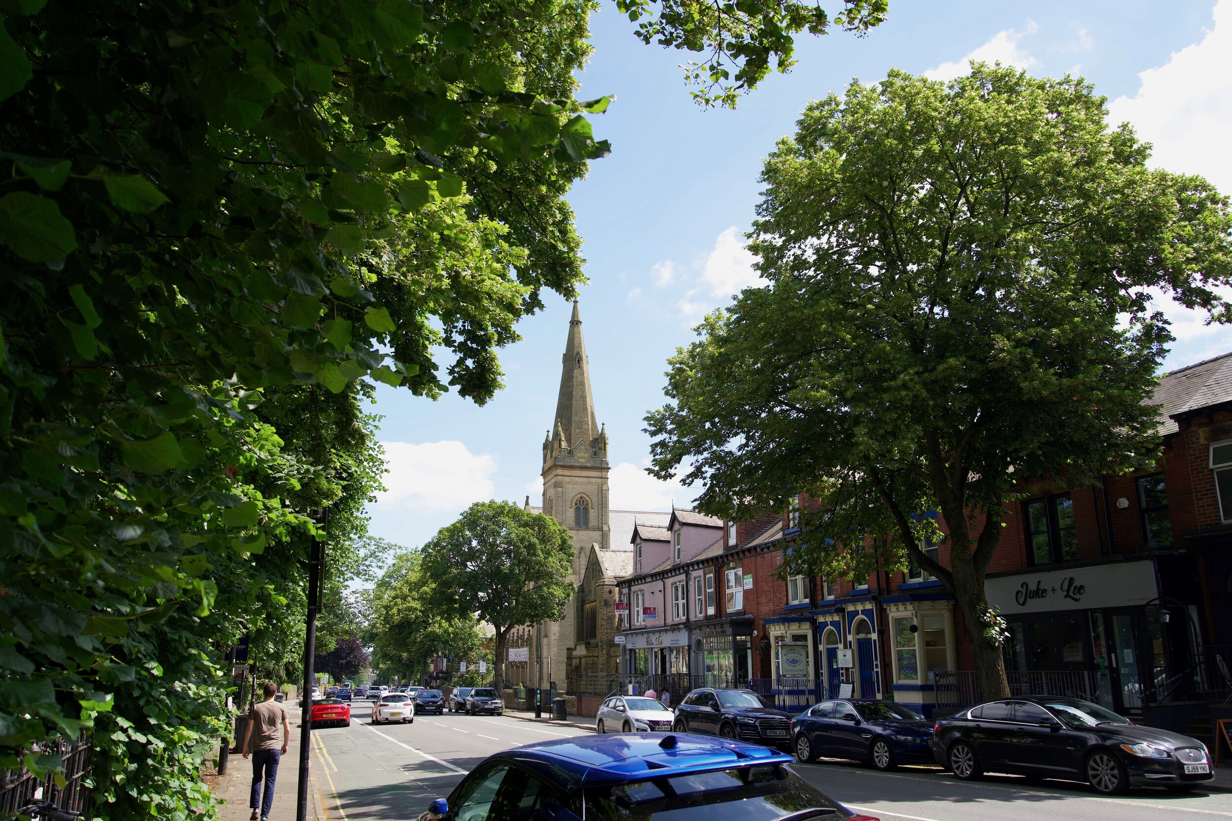
sheffield landmarks
These landmark images can draw on identifiable attributes without showing the entirety of the building (e.g. the cheese grater car park). The Well is ‘serving Sheffield’, this home, using iconic buildings helps reinforce that The Well is geographically present.

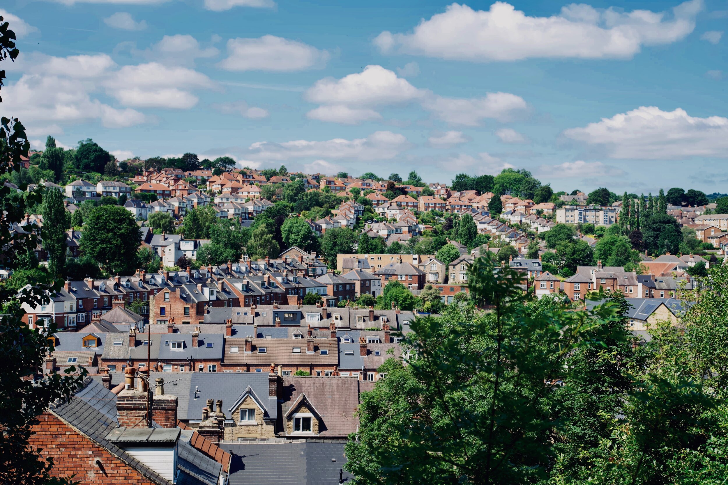
sheffield landscapes
Consider drone images and pictures of key Sheffield landscapes in context (e.g. Uni buildings in student-related communications)

sea/ocean
Whilst Sheffield is not near the sea, since the launch of the church in 2015 we have used images of water, pointing us to many biblical references and to need to go deeper in our walk of faith. These images should be geographically hard to assume (just water, muted colours, avoid non UK wider scenes)

trees & green
We can draw on the natural aesthetic of things that are geographically appropriate. For example, The Well is close to Endcliffe Park and the Peak District. Using pictures of ferns, vegetation, trees, and the Peaks themselves not only helps with framing our locality but the visuals are calming and can represent new life and growth we have in Jesus.

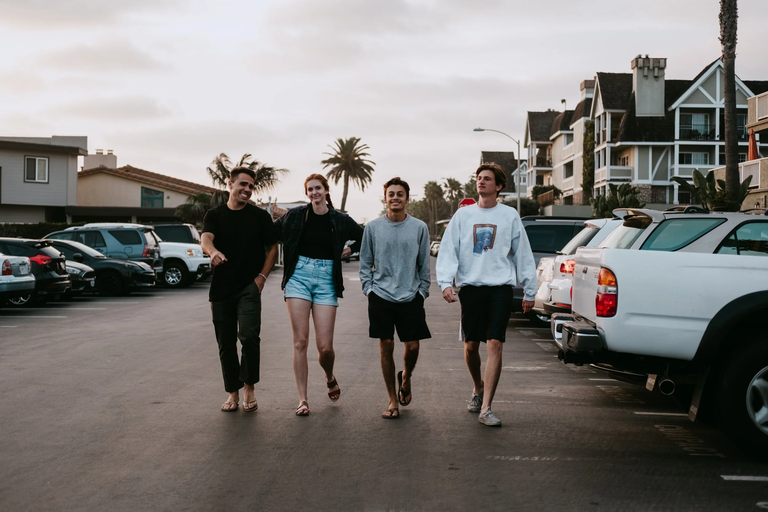
people
Photos of people should be contextually accessible to everyone and invite viewers into that moment. Ideally they will show a real moment avoid staged scenes. Also, we avoid taking photos or using images from the sanctuary that may be hard to understand when viewed out of context to someone with no experience of a spiritual encounter for example.
Images should try to focus on the foreground and provide depth, try to use natural light and moments of reality.
make originality the priority
Pictures should be original where possible - produced by The Well staff team/volunteers.
Use of stock images maybe used in addition via Unsplash or Canva. With Unsplash ensure you select ‘newest’ photo first to avoid using the most popular images which may be in use elsewhere by others.
See next section on good use of stock images.

stock images - good use
When using stock images our preference is Unsplash for which are staff team are key contributors. Images of people should mean the persons are hard to identify, the setting should be some that could be local to The Well. If you must use stock imagery, prioritise a scene that creates an positive emotional reaction, rather than for example thinking that a young adults event must include pictures of young adults.
bad use of stock images
This is an example of what you SHOULD NOT USE.
Why? If you use stock imagery with persons, ideally we should not see their faces. Further more, this is clearly not Sheffield - identified by the trees, cars and building design.
Never use stock images that include people but are absent of geographical context.

authenticity
Photos must avoid cliche images (lion and lamb in clouds for example), and they must not misrepresent the reality of an event . This image for example would be inappropriate to use to promote a worship event in the cafe - yes the images shows worship but misinforms a prospective attendee of what that event might be like. It would be much better to show a close up of a guitar or keyboard for example, or a picture of the actual event.
How The Well uses language is a really important aspect of communications and is connected to the brand.
The Well is also spelt with uppercase T+W.
The Well avoids using the terms ‘we’, ‘our’ and ‘us’. These words can suggest that others are invited to something that doesn’t belong to them.
For example instead of ‘We want to invite you to our carol gathering’ it would be ‘Carols at The Well - you’re invited!’.
Instead of ‘Join us this Sunday for a BBQ’ it would be ‘Join The Well for a BBQ this Sunday’. The word ‘us’ implies an us-them element more than many other phrases.
In written English it can be easy to lose enthusiasm with what is being conveyed so the use of ‘!’ and fonts like GOBOLD help drive the impact of ‘Hey You!’ for example.
Avoid ever including a positive-negative. For example, instead of ‘Why not join us this Sunday?’ it would be ‘Join The Well this Sunday’. Don’t ask the audience to provide you a reason why they shouldn’t do something you want them to do, instead be positively inclusive.
Avoid ‘christianese’. Yes you can unpack things with biblical accuracy in the context of a gathering, but outward-focused communications need to be written in a way that anyone reading them on the steps of the church would understand.
The Well’s voice should encompass the values, be positive, inviting, warm and accessible.